Learn how to prepare artwork for DTF (Direct to Film) printing by understanding transparency, white ink and adhesive coverage.
Creating Artwork for DTF Printing
The biggest differences when creating artwork for Direct to Film (DTF) printing - compared to printing on fabric or paper - are:
- How transparency is handled
- How white ink is applied
- How adhesive coverage depends on ink density
We’ll walk through each one step by step so your artwork prints perfectly the first time.
What is DTF?
DTF (Direct to Film) printing creates a transfer sheet that can be heat pressed onto almost any surface - fabric, leather, wood, metal, and more.
The printer layers colour, white ink, and a powdered adhesive which melts into a glue layer.

The process
- Print your artwork onto a PET film
- Apply powdered adhesive to the wet ink
- Melt and cure the adhesive into a solid layer
- Cut and press onto your final surface
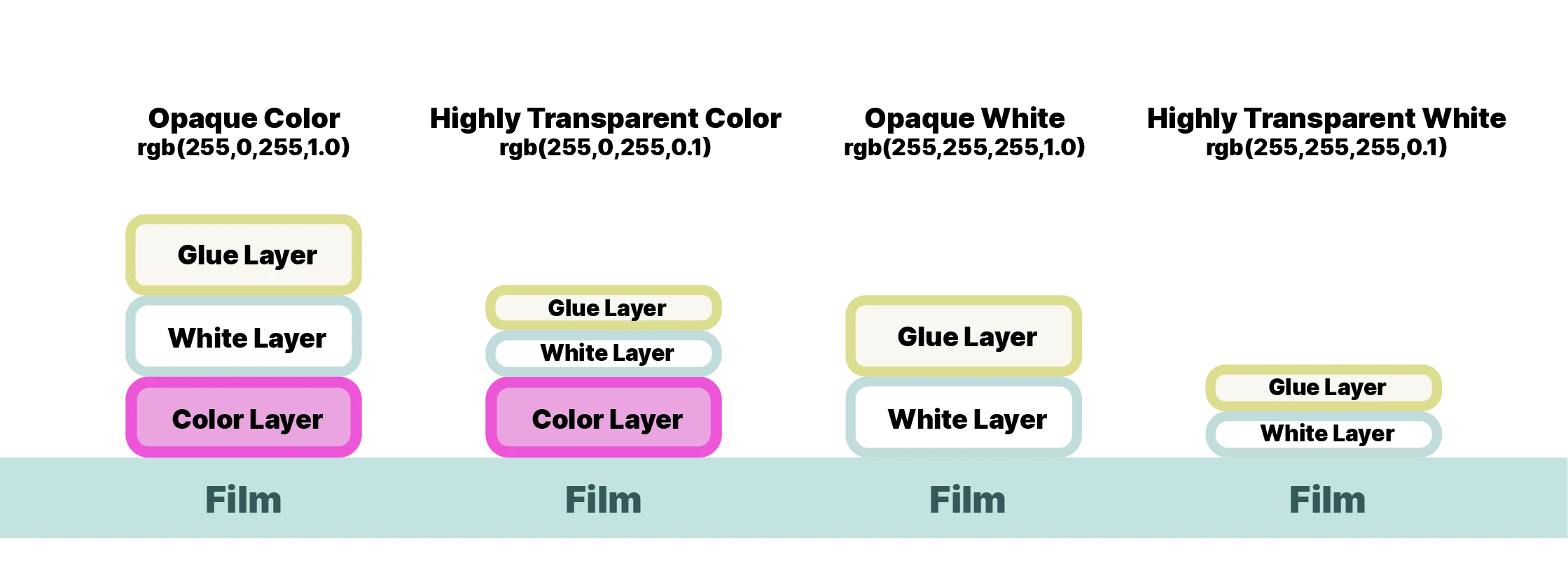
Transparency & White Ink
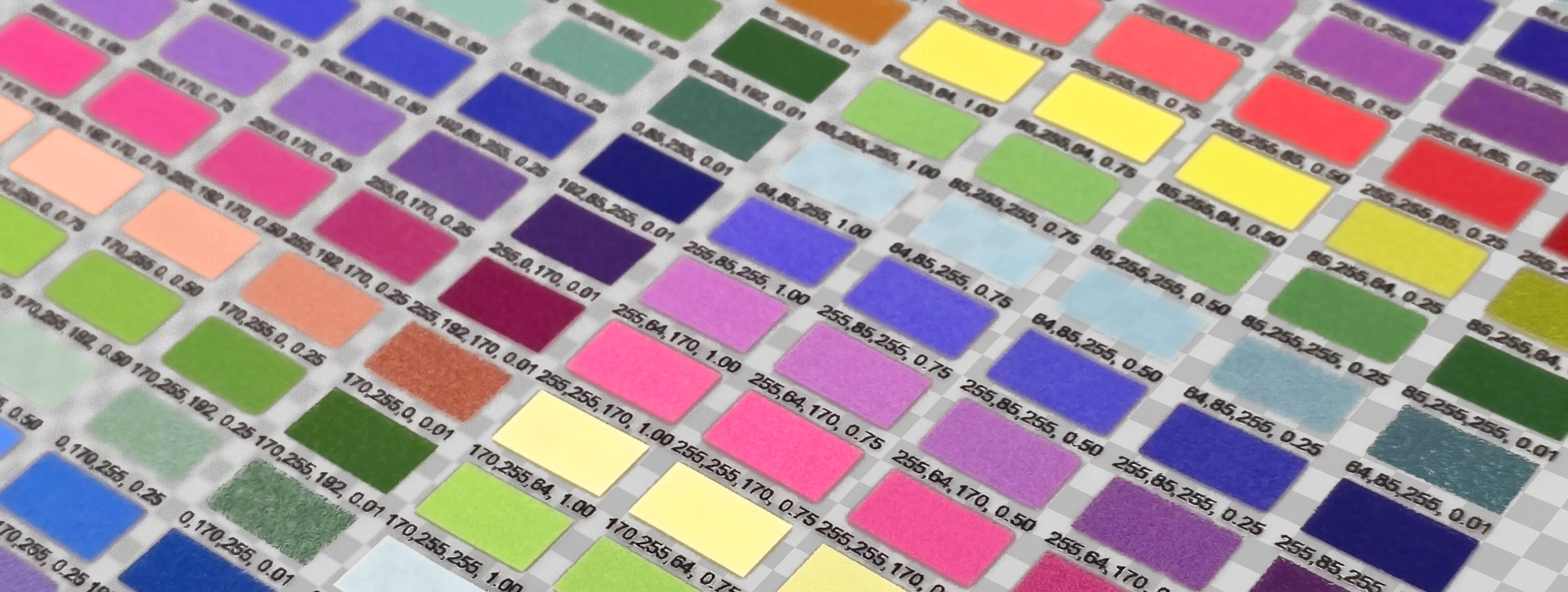
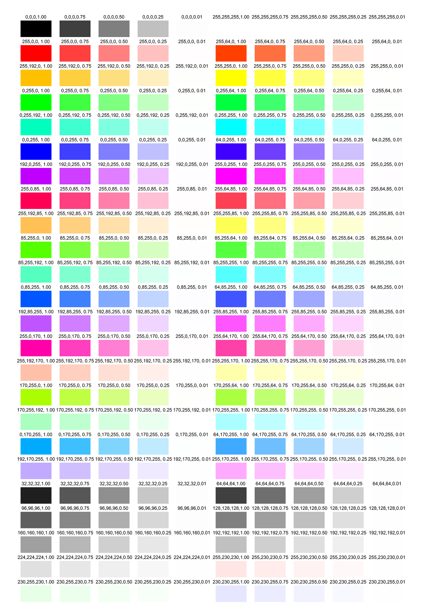
Unlike normal printing, transparency in your artwork affects how much white ink is printed behind the colour.
The white layer determines how opaque or solid your colour appears once transferred.
Think of it like this:
| RGBA Value | Colour Ink | White Ink | Result |
|---|---|---|---|
| rgba(255,0,0,1) | Full red | Full white | Solid red print, appears the same on all backing colours |
| rgba(255,0,0,0.5) | Full red | 50% white | Red appears slightly translucent, backing colour will start to impact appearance |
| rgba(255,0,0,0.05) | Full red | 5% white | Solid red, but slightly translucent - backing colour shows through prominently, glue may look patchy |
| rgba(255,0,0,0) | No ink | No white | Completely transparent |
| rgba(255,240,240,1) | Full pink | Full white | Light pink print, appears the same on all backing colours |
| rgba(255,240,240,0.5) | Full pink | 50% white | Light pink appears translucent, backing colour will start to impact appearance |
| rgba(255,240,240,0.05) | Full pink | 5% white | Light pink, but slightly translucent - backing colour shows through prominently, glue may look patchy |
| rgba(255,220,220,0) | No ink | No white | Completely transparent |
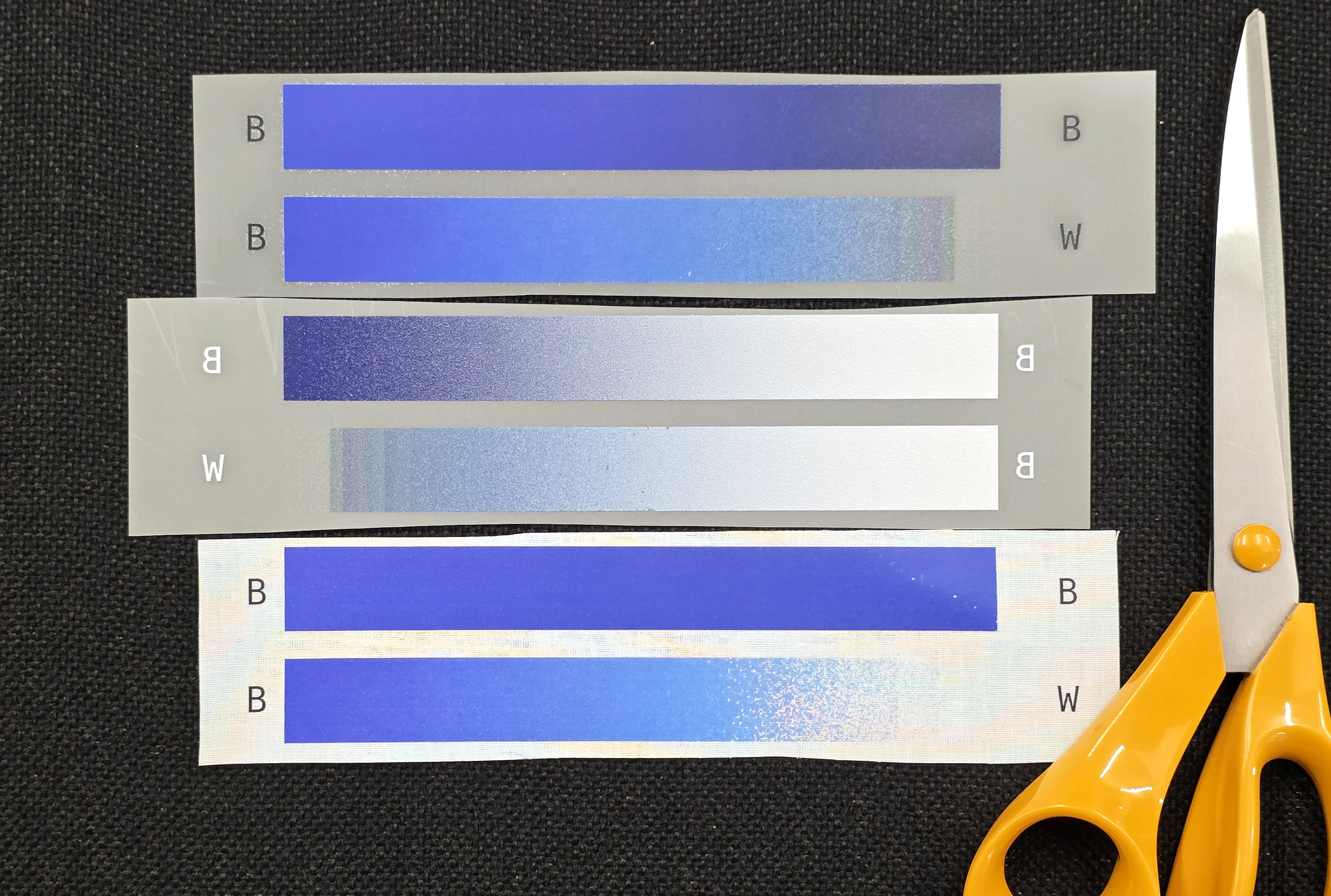
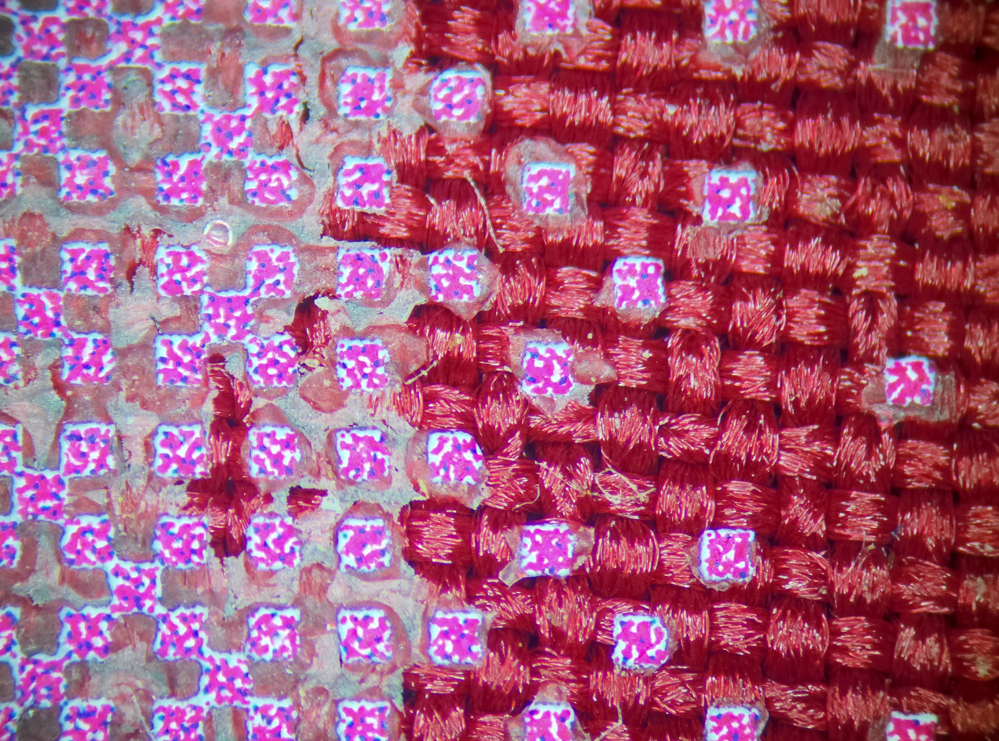
This is the same image transferred to white fabric, and dark red fabric. This also demonstrates that areas of lower ink coverage do not trap enough adhesive to effectively stick to the fabric (seen as cracked or patchy areas).
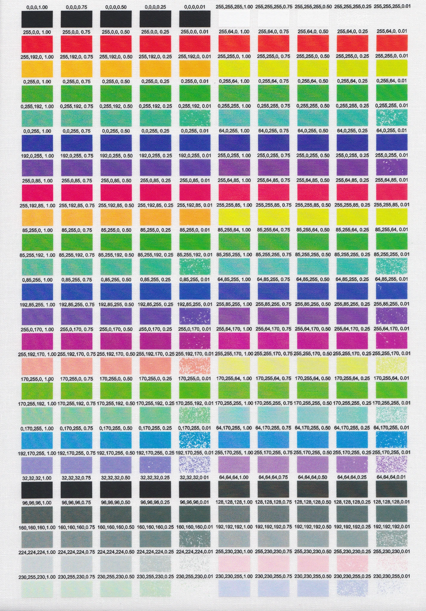
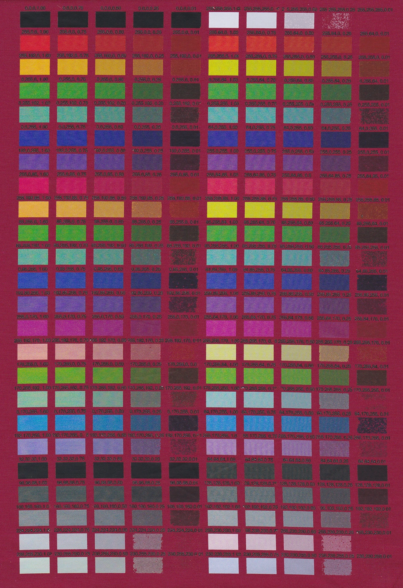
Areas of higher transparency mean less white ink coverage. Lighter colours mean less colour ink coverage. Combine the two, and you might not have enough adhesive for the design to properly stick to the fabric.
Gradients and Fades
When fading to transparent, your gradient should go from coloured pixels to transparent white, not to transparent versions of your colour.
If you fade to coloured transparency (like semi-transparent red or black), you’ll still get full colour ink printed - but less white ink behind it, which can create unintended patchiness.
Glue Show Through
With highly transparent colours, you may still see the colour of the glue show up against the colour of your substrate. This can leave a light halo around these areas, which might be what you want.
To play it safe, if you're transferring onto a darker substrate, do not use partial transparency and rely on other methods instead.
Ink Density and Adhesive Pickup
The adhesive powder sticks to ink, not the film.
That means very light or low-opacity areas might not hold enough glue to transfer properly.
For example:
-
rgba(224,224,224,0.1)→ Too faint; may not pick up enough glue, and transfer may fail -
rgba(224,224,224,0.5)→ Better; enough ink to grab adhesive
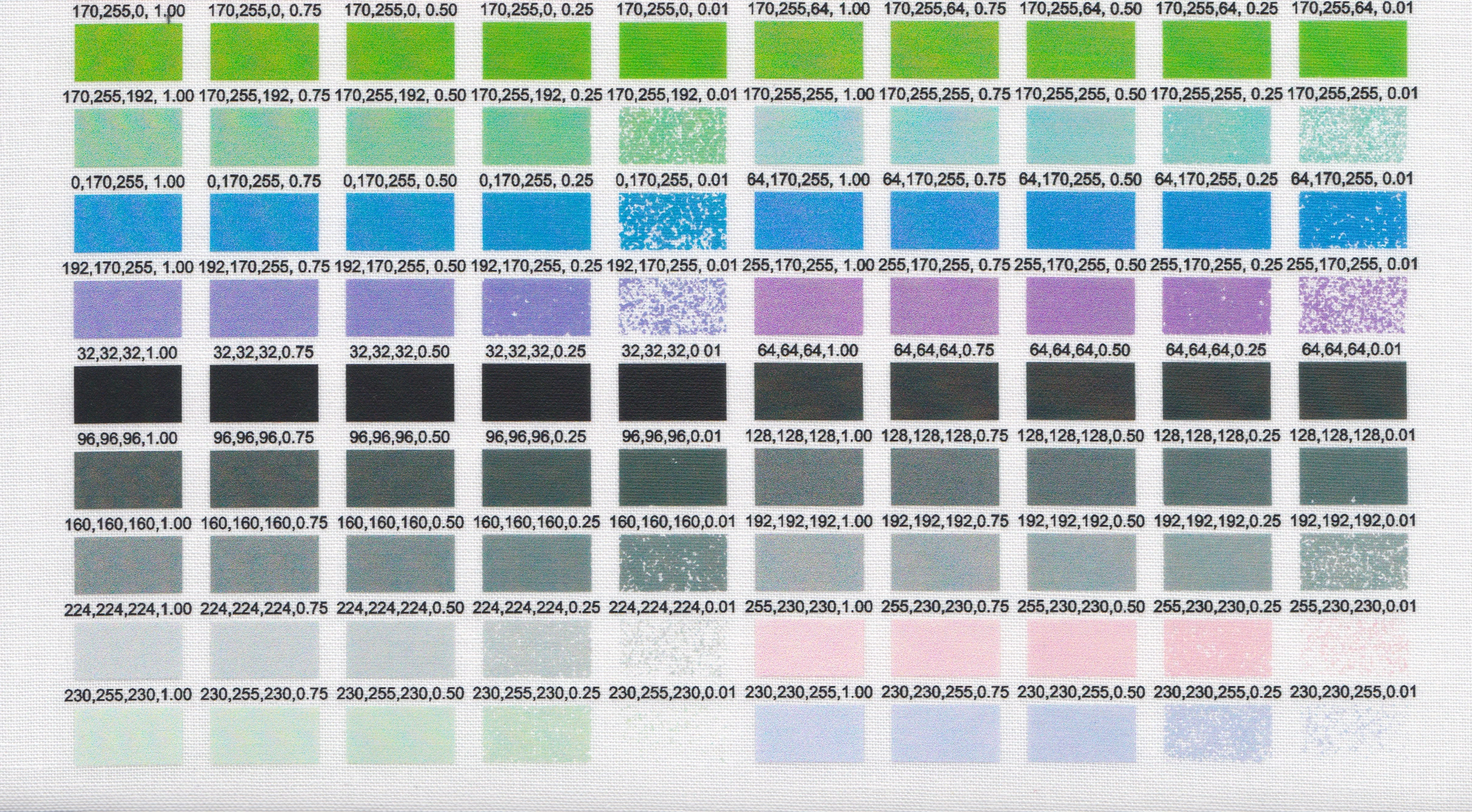
Tip: Keep even light colours at least 50% opacity to ensure they transfer cleanly.
White Ink / Adhesive Bleed Between Elements
When coloured elements are too close together, the white or adhesive layer behind them can bridge the gap - spreading slightly underneath and between the colours.
This can make small gaps or outlines appear lighter or washed out, especially on dark fabrics.
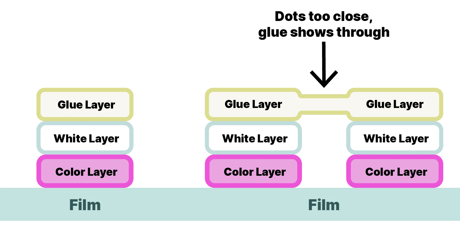
Why it happens
- The printer lays down a continuous white underbase to ensure solid coverage
- When two shapes are close, their white underbases can merge
- During curing, the adhesive layer also softens and flows slightly, further blending the boundary
How to avoid it
- Leave > 0.2mm gaps between separate elements if you need clean separation
- Avoid very fine outlines or internal gaps in dark-on-dark artwork
- For small text or intricate icons, add a slight stroke or knockout to keep definition
- Keep details above a certain size
This effect is sometimes called white ink bridging, haloing, or white bleed - and it’s more noticeable on dark substrates.
Recommended File Settings
- File type: PNG or TIFF (supports transparency)
- Colour space: RGB
- Resolution: 300 DPI
- Fully transparent areas → No print
- Fully opaque areas → Full colour + white ink + adhesive
- Semi-transparent areas → Partial white ink
Example: Transparency in Practice
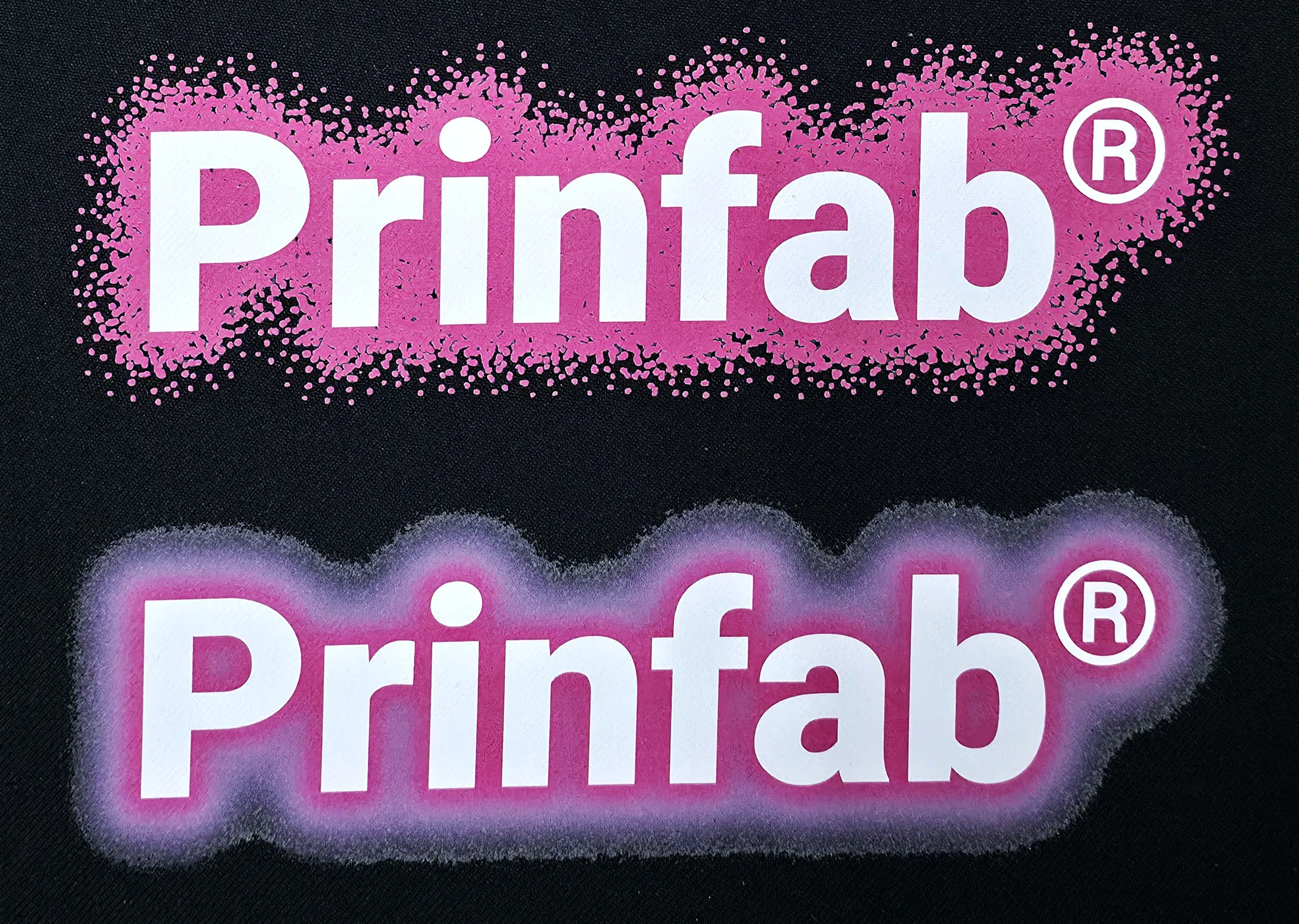
In the example above:
- The top uses a dot pattern to fade out a solid colour stylistically
- The bottom uses a "glow" effect which doesn't translate to DtF in a nice way
Summary Checklist ✅
Before uploading your DTF artwork:
- ✅ Use PNG or TIFF with transparency
- ✅ Try to stick to full opacity or fully transparent
- ✅ Fade gradients to transparent white, not transparent colour
- ✅ Keep pale areas above 50% opacity for reliable glue pickup
- ✅ Leave small gaps between elements to prevent white ink bleed
- ✅ Preview your gradients carefully - what’s transparent in your file will be transparent in print
 Loading...