
Colour spaces and profiles are confusing at the best of times - this post will help clear up any confusion.
When starting surface pattern design, or any kind of print design, it won’t be long before you enter the messy and confusing world of colour spaces and colour profiles.
This guide should hopefully help to alleviate some of the confusion and leave you feeling more confident to tackle the subject.
Contents
What is a colour space?

In it’s simplest form, a colour space is a way of describing a colour so that it can be reproduced reliably.
Most colour spaces describe colour in terms of components that are mixed in a specific way to produce an output colour.
For example, the RGB colour space is described by Red, Green and Blue components that are additively mixed to produce an output colour.
Some colour spaces work with references, e.g. the Pantone collection, assigning each colour a name or identification number.
For digital print, there are two main colour spaces we need to worry about:
- RGB
- CMYK
RGB is an additive colour space, meaning you start of with black, and add colours (red, green and blue) together in certain amounts to achieve the required output, with the maximum amount of all 3 components making white.
CMYK is a subtractive colour space, meaning you start of with white, and add colours together (cyan, magenta, yellow and optionally black) in certain amounts to achieve the required output, with the maximum amount of all 4 components making black.
RGB is the space typically used by display and capture devices, e.g. cameras, scanners, computer and phone screens, etc.
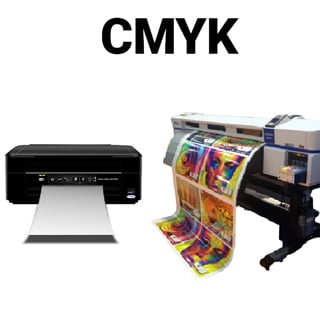
CMYK is the space typically used by production devices, e.g. printers.
What is a colour profile?
A colour profile is a way of characterising how a certain device captures or displays colours. Any device that captures or displays colours in any form can have an associated profile.
A profile tells a device how it displays or prints colours, or how it captures colours. It gives us a way to transform a colour that is captured by a camera, to one that we see on a screen, to a colour that we’d like when printed.
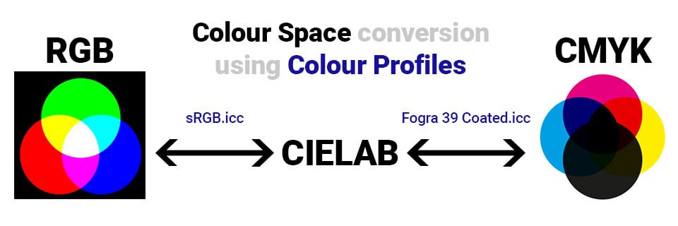
Profiles are like a map - they let you transform from one colour space to another, via an intermediary colour space known as CIELAB (or sometimes CIEXYZ).
To convert an image from an RGB colour space (e.g. sRGB) to a CMYK colour space (e.g. Fogra 39 coated), you would first use the sRGB profile to convert the RGB image to the CIELAB colourspace. Once in the CIELAB colour space, the Fogra 39 coated profile can be used to transform the image from the CIELAB colour space to the CMYK colour space.
By default, most digital images use the sRGB colour space. In addition, most software is only capable of displaying sRGB images, for example all internet browsers. If you try and view an AdobeRGB file or a CMYK file in Google Chrome or Internet Explorer, it may not display correctly. For example:

Compared to how it should look:
Some operating systems and some browsers will render the top image correctly, and some won’t - in short, when working with images that are intended to be viewed on screen, your only reliable option is sRGB.
As a quick note, if there is no profile embedded in the image, most software will assume it is sRGB, and display it as such.
To further illustrate the difference, take a look at these two files:


Do they look different? They should. This is what it should look like:

If they both look like the image on the left, then your browser doesn’t respect embedded profiles.
Which colour space/profile should I use?
In general, it’s best to stick with the RGB colour space, and sRGB v4 Preference colour profile.
The sRGB colour profile has a large gamut, is well supported, and should serve you well for almost all purposes.
At Prinfab we use an expanded CMYK ink set, giving us a larger gamut than most CMYK profiles, so by using CMYK you’re only limiting yourself to the amount of colour you can use. By using sRGB you will get more vibrant colours.
Here are some examples of images that have been converted to CMYK. You can see the colours lost, especially in the fluorescent/bright primaries:
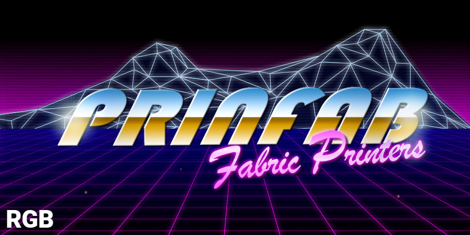

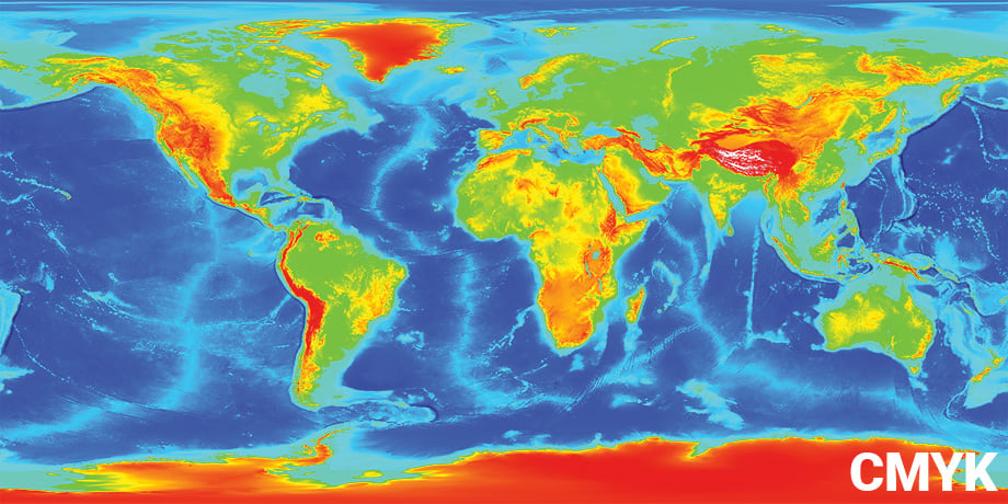
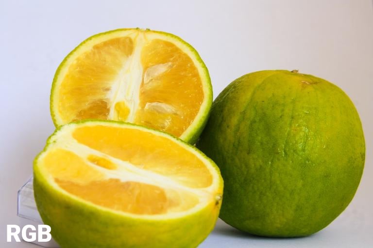
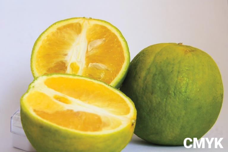
Even at Prinfab, our printers don’t cover the whole sRGB gamut - given the inherent differences in the additive vs subtractive colour space, the colours are never going to be exactly the same.
If you would like a very rough preview of how a file will look when printed, you can use the soft proofing tool in Photoshop (or equivalent software) and select Fogra 39 Coated as the proof profile, ticking the ‘Simulate paper color’ and ‘Simulate black ink’ boxes.
Sample Image for Testing Colour Profiles - The Image of Shame!
If you would like, you can use the following image to test which of your favourite website manage their colours properly.
Just save this image, and upload it to your favourite sites and see if she turns purple:

If she ends up looking like this:

Then you should probably walk away and find somewhere that respects colour profiles!
 Loading...