What DPI should you choose when viewing an image from 50cm, 1m, 6 feet?
When you’re creating something for print, when you first open a document, you’ll be presented with a dialog that looks something like this:
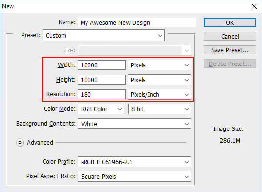
So what should we choose on this dialog? What are the correct options?
Contents
What is DPI?
DPI stands for ‘Dots Per Inch’ and describes how many pixels there should be per inch when the image is printed.
Generally, the higher the DPI, the higher resolution the image and the more detail will be in the final print.
What settings should I use?
Generally, when making an image for print, you’ll want to think in terms of real measurements (cm, m, inches, etc) and DPI or PPI, which we can use interchangeably for our purposes.
If you wanted your image to be 10 inches wide, and wanted it to be sharp from distances of 3 feet, then your image would need to be 1800 pixels wide.
Most image editing software will do this all for you:
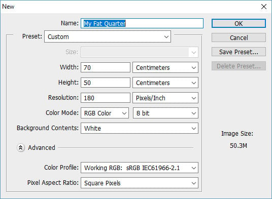
You can just enter in the DPI and the measurements, and it will create a document at the correct size.
DPI and Viewing Distance - What DPI should I choose?
What DPI you should aim for depends on what the end use of your print will be.
For most applications, especially on printed fabric, 180DPI is more than enough for most purposes and will serve you well. (Printing on fabric has it’s own limitations, and so printing using a higher resolution/DPI image won’t necessarily increase the printed resolution).
The main thing to take into account is the viewing distance.
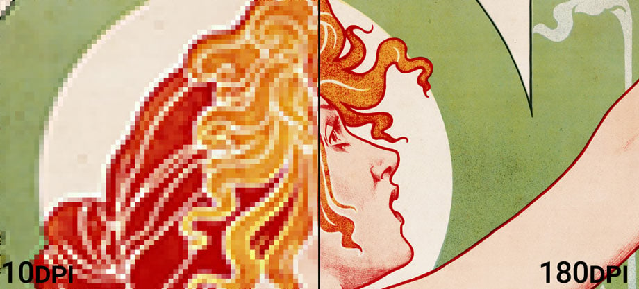
If you’re viewing something very close up, you’ll need a high DPI for it to appear sharp and not see any pixellation, like in a magazine or book. Magazines are typically printed at 300DPI (actually magazines typically use halftone screens, with 150 LPI, but that’s another story!).
If you’re viewing it from very far away, like a large poster or billboard, then you can get away with a low DPI. Billboards are typically made at between 10 and 50DPI.
Of course, there is a lot of room for variation - for example text might require higher DPI settings than photos, because there are more small details in text than in photographs.
Here’s a handy table for determining what DPI to use for common viewing distances
| Min. Viewing Distance (m) | Min. Viewing Distance (in) | Min. Resolution (DPI) |
|---|---|---|
| 0.5 | 20 | 360 |
| 1 | 40 | 180 |
| 1.5 | 60 | 120 |
| 2 | 80 | 90 |
| 2.5 | 100 | 72 |
| 3 | 120 | 60 |
| 5 | 200 | 36 |
| 10 | 400 | 18 |
| 20 | 800 | 9 |
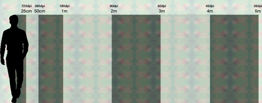
And here’s a handy image showing commong viewing distances and DPIs with a human for scale:
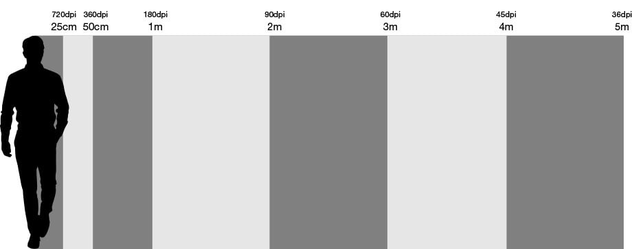
Image Sizing Calculator
If you still find yourself getting stuck, this calculator can help you choose the correct DPI, viewing distance and image dimensions.
Simply change any of the fields and all the others will update accordingly:
 Loading...