Colour matching can be tricky - this guide will help you to get the perfect colours every time.
If you’re creating a piece of custom printed fabric that needs to match another item, for example a sofa, some wallpaper or curtains, then you’ll naturally want the closest match possible when it comes to colour.
Because of the way our eyes work and the way screen technology works, matching a real world colour to a colour on screen can be an extremely difficult task.
Traditionally, this is where colour matching systems such as Pantone® come in, however, we’re going to go through an effective DIY method of colour matching.
Contents
Eye vs Screen
The most important thing to know is you cannot compare real world colours with colours on screen 100% reliably.
There are a number of factors involved when trying to colour match a real world object:
- Lighting on the Object
- Eyesight
- Screen Calibration
- Lighting Around the Screen
- Printer Calibration
- Texture of the Final Print
- Lighting on the Final Print
Human eyes are wonderful things, and they correct for an infinite number of situations to give us good eyesight in a huge range of situations. This, however, can work to our detriment when it comes to colour matching.

As an example, if you’re in a room lit by normal tungsten lightbulbs (or warm LED lights) these tend to give out light with a yellow colour cast. Our eyes are good enough to completely correct for this change in lighting colour, so that a white piece of paper still looks white.
Here’s an example of a scene lit with tungsten lights, and a colour corrected version (which is what our eyes do automatically).
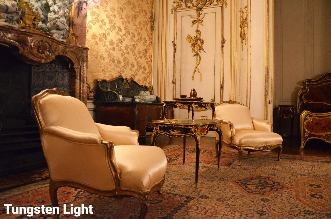
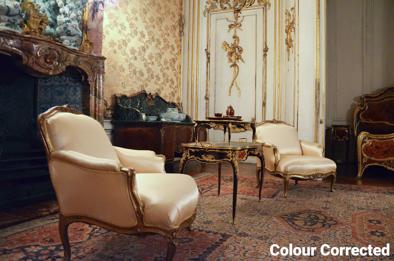
If you’ve ever taken a photo in a dimly lit restaurant, you’ll know about the colour cast that tungsten lights give to a scene. Your photos will have probably come out orange.
Compounding this matter, most screens found on computers, laptops, phones and tablets have a colour cast to the light they give out. If you have never calibrated your screen, then you cannot rely on the colours it produces - and even if you have, the inherent difference between how screens produce colour and how a printer produces colour means that the colours will never match up perfectly.
Hard Proofing
The only way to get truly reliable colour matched prints is hard proofing.
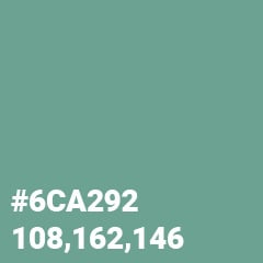
To illustrate this, let’s pretend we want to create a colour match for the green in this sofa:
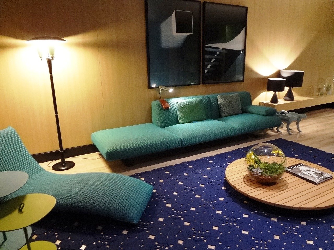
Now, looking at the image of this sofa, there are a wealth of different colours actually present:

So, I’m going to take the one that looks closest to my eyes:
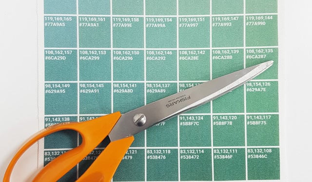
To do a hard proof, first you need to make a sample image. A great way to do this is to create a small colour chart:
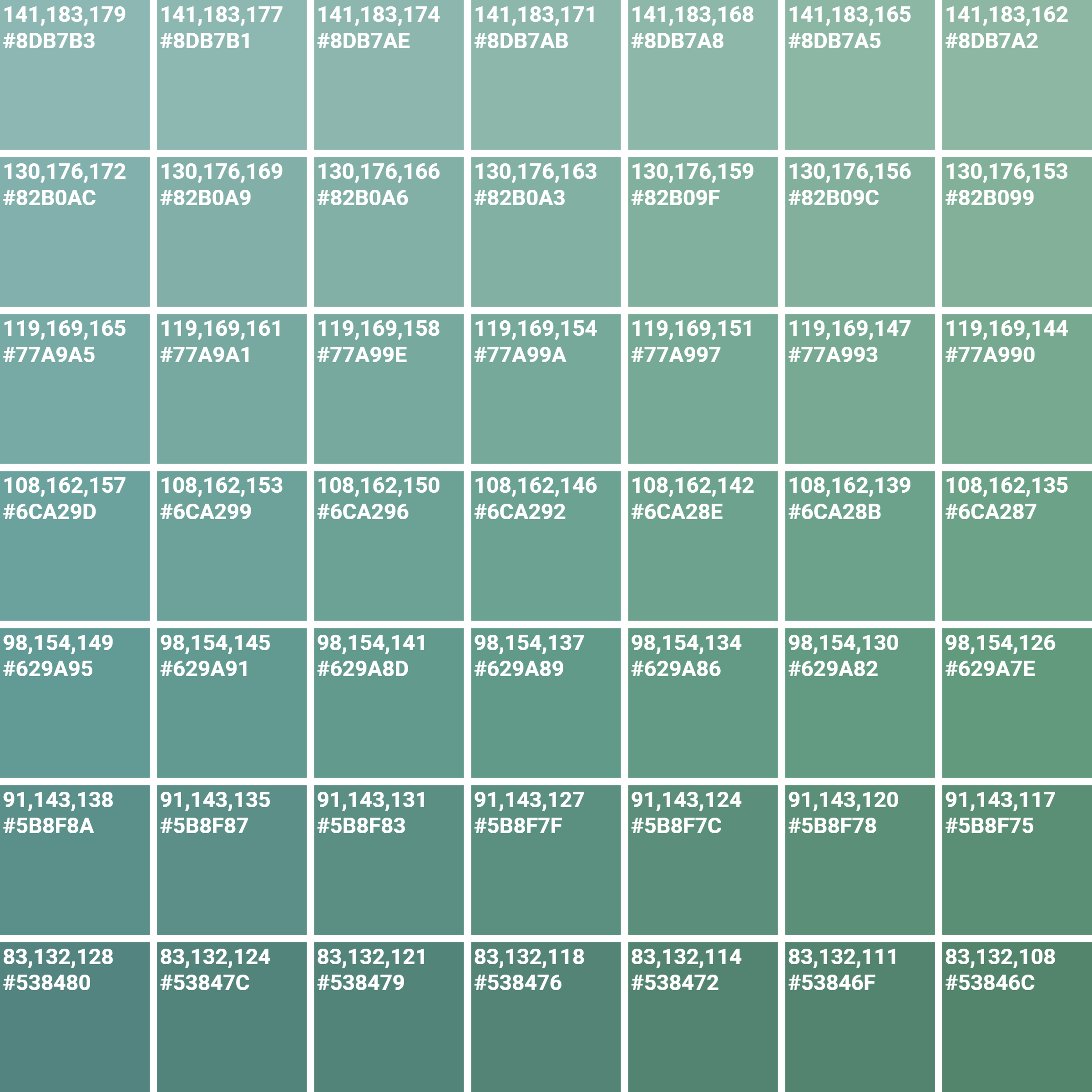
Now, you need to print out this image on your fabric of choice. Once you’ve printed out your chart, you can physically compare the colour on the chart with the item you wish to colour match, and choose the closest match available.

If it’s not quite close enough, you can use the closest match as a starting point for another hard proof, and repeat the process.
Once you’re happy with the colour in your hard proof, you can go ahead and use the colour in your designs. Using the green above, I created this cushion cover print to nicely match the colours:

That’s not actually my living room above, but here’s the finished product!

Top Tip
When colour matching using your chart, it really helps to cover all but one square on the chart, like this:
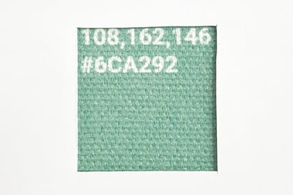
That way, you’re not put off by any of the other colours on the chart and you can directly compare to just one of the little swatches.
 Loading...